
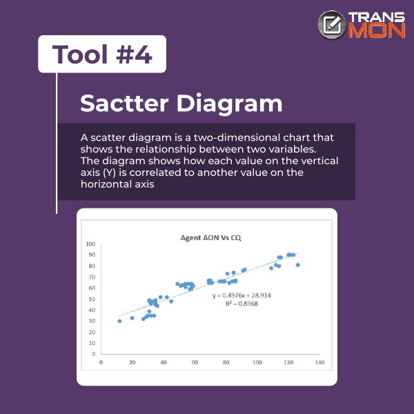
One of the Quality Monitoring tools – A scatter diagram is a two-dimensional chart that shows the relationship between two variables. It is also called a scatter plot or scatter graph. The diagram shows how each value on the vertical axis (Y) is correlated to another value on the horizontal axis (X); used to visualize the correlation between one independent and one dependent variable.
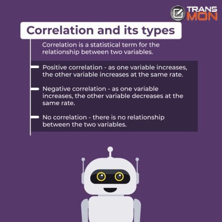
Correlation – Correlation is a statistical term for the relationship between two variables. Types of Correlation are Positive, Negative, and No Correlation
- Positive correlation means that as one variable increases, the other variable increases at the same rate.
- Negative correlation means that as one variable increases, the other variable decreases at the same rate.
- No correlation means that there is no relationship between the two variables.
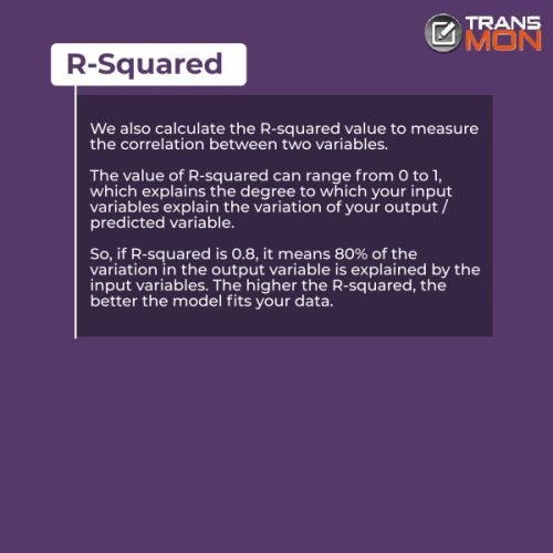
We also calculate the R-squared value to measure the correlation between two variables. The value of R-squared can range from 0 to 1, which explains the degree to which your input variables explain the variation of your output / predicted variable. So, if R-squared is 0.8, it means 80% of the variation in the output variable is explained by the input variables. the higher the R-squared, the better the model fits your data.
In simple terms, it represents how much of a change in one variable causes a change in another.
For example, if you have two variables (say X and Y) and you know that they are strongly correlated then it would be reasonable to assume that most of the variation in X can be predicted by knowing Y.
How to do it in Excel
Example of Scatter Diagram (Prepare it on Excel) –
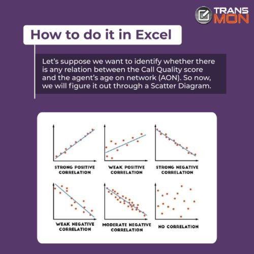
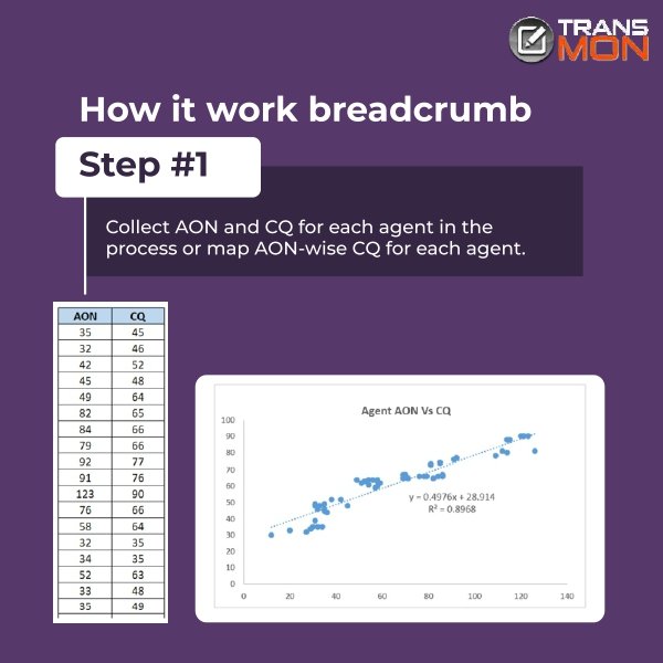
Let’s suppose we want to identify whether there is any relation between the Call Quality score and the agent’s age on network (AON). So now, we will figure it out through a Scatter Diagram.
Step 1
- Collect AON and CQ for each agent in the process or map AON-wise CQ for each agent.
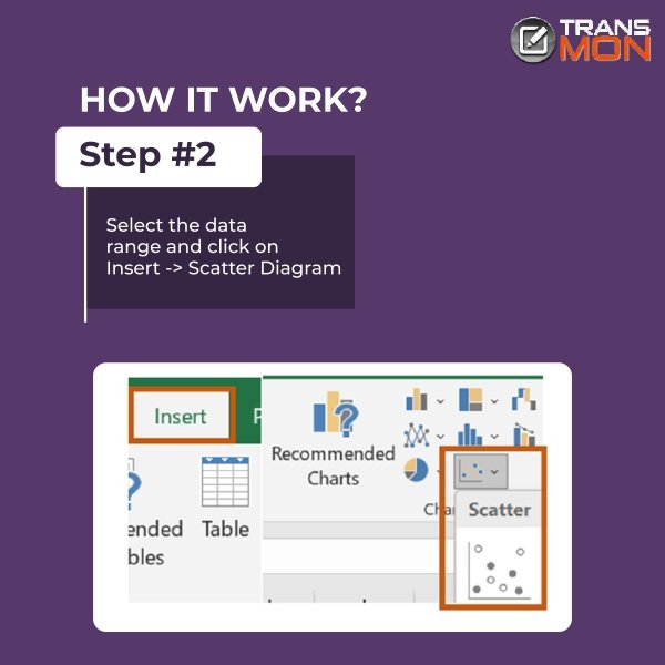
Step 2
- Select the data range and click on Insert - Scatter Diagram
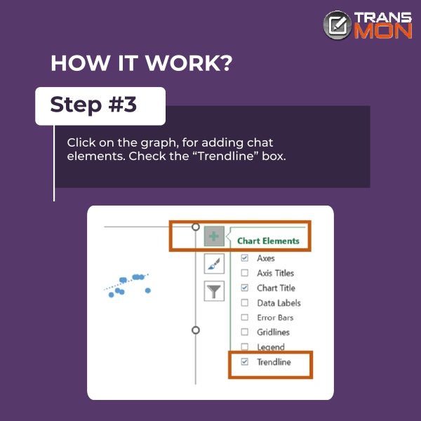
Step 3
- Click on the graph, for adding chat elements. Check the “Trendline” box.
Step 4
- Then Click on the trendline - Right Click - Format Trendline - check the box for adding equation on chart and displaying the R-squared value on chart.
Eventual Outcome
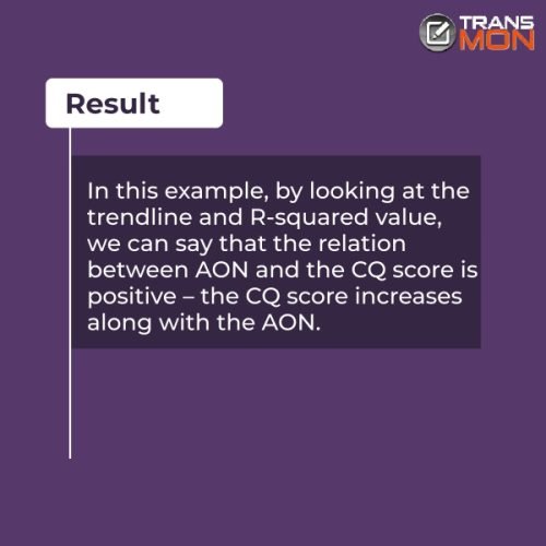
In this example, by looking at the trendline and R-squared value, we can say that the relation between AON and the CQ score is positive – the CQ score increases along with the AON.