One of the most important tools which is also the widely used one in Quality Domain – Pareto Analysis; a decision-making technique.
Invented by Karl Pearson, an English mathematician; The histogram is used to summarize continuous data that are measured on an interval scale.
It is named after the Italian economist Vilfredo Pareto.
Pareto Analysis is a formal technique useful when many possible causes are competing for attention. In essence, the problem-solver estimates the benefit delivered by each action, then selects a number of the most effective causes that will deliver a total benefit reasonably close to the maximal compliant output.
While Pareto is commonly referred as “80/20” rule, under the assumption that, in all situations, 20% of causes (“Vital few”) determine 80% of problems, this ratio is merely a convenient rule of thumb and is not, nor should it be considered as an immutable law of nature. This is usually used for setting up priorities that impact an outcome the most. This helps determine where you can focus your efforts to maximize your output.


Example of Pareto
- As we said, The Pareto Principle helps you realize that the majority of results/outcomes come from the vital few causes. Below are some interpretations
- 20% of defects contribute 80% of overall Quality Score: First focus on fixing those errors.
- 20% of the customer complaints are from billing, Contributing 80% of churn: So, coach your advisors well on this topic.
- 20% of BQ advisors are contributing to the 80% disruption in the AHT of the process; Try to bring down their AHT to see traction on overall AHT.
- 20% of the geography, contributes to 80% of the network complaints in the Telecom sector.
- 20% of the students pull back 80% of the passing score.
Pareto Chart
Pareto Chart is a representation of the Pareto principle through a combination Chart (Combination of bar and line graph). The individual values are signified by the length of the bars and the line in the graph shows the Cumulative Frequency percentage. The values are stated from the longest bar to the shortest bar in the graph (Sorted in descending order).


Step 1
- Collect similar category data along with its count (All causes of a problem) and sort in descending order; calculate the sum.
Step 2
- Calculate the percentage of each data type (data Type count/Sum total).


Step 3
- Calculate Cumulative frequency distribution, it will be calculated successively by adding the percent with other frequencies.
Step 4
- Select the data range and click on Insert - Insert Statistic Chart - Histogram - Pareto
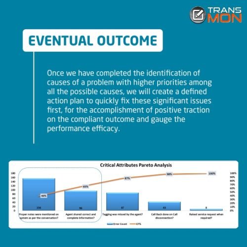
Let’s create a Pareto chart for critical defects in one of the line of business in the contact center industry, impacting overall CQ – below is the table for the chart


Eventual Outcome
Once we have completed the identification of causes of a problem with higher priorities among all the possible causes, we will create a defined action plan to quickly fix these significant issues first, for the accomplishment of positive traction on the compliant outcome and gauge the performance efficacy.

